Customizing Maps: Enhancing Spatial Visualization
A map is only as good as its readability. Beyond the basic shapes, spatial data often requires specialized design choices, from picking the right color palettes for regions to adding essential context like labels, scales, and north arrows that guide the viewer through the landscape.
In this lesson, you’ll learn to fine-tune the aesthetics of your maps. We’ll explore custom map themes, effective labeling for geographic features without cluttering the view, and techniques for highlighting specific regions to make your spatial narrative pop.
Modifying Maps
We've seen how to plot spatial vector data with our "sf chameleon" geom_sf() but so far we only tweaked the two-dimensional projection and the properties of the geom. But spending some time on creating a more polished, visually compelling map does not only make your work look more professional but also increases understanding and engagement.
We will focus on five key techniques to customize maps:
- Custom color palettes to create more meaningful data representation (building on the lessons on Color Choice and Color Palettes from Module 2).
- Labels and annotations to add context (building on Annotations & Callouts lesson from Module 3).
- Highlight boxes and zoomed views to emphasize regions and provide more detail.
- A short excursion on combining maps with
patchwork(building on Plot Composition lesson from Module 4). - Thematic elements like north arrows and simplified borders.
🎨 Get the Color Right!
As usual, each aesthetic has a corresponding scale that controls how the aesthetic is mapped to the data. And as with regular charts, you can replace the default color palette with a custom one.
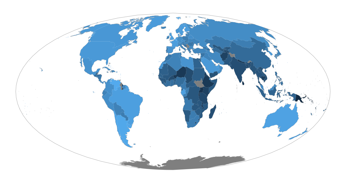
As discussed before, the default gradient is far from optimal. And in this case, it's even more problematic: in maps, blue colors are usually reserved for water bodies!
To use a different color palette for the choropleth map showing shares of urban population per country, we address the fill aesthetic with a scale_fill_* of our choice.
Let's imagine our story focuses on the urban population extremes on both ends: the "most people live in cities" countries but also the "most people live in rural areas" countries should be the main actors in our map (speak: should receive the most attention and thus be colored with colors of high contrast).
Hmmm, what was this type of color palette called, by the way?
No clue? Click to reveal the answer!
A palette that emphasizes both ends of a spectrum is called a "diverging palette": it's basically built by combining two gradients with a shared, neutral color in the middle. We cover all this in our lesson on "Color Choice" if you'd like to refresh your knowledge!
That means: We can simply pick one of the many available scales from ggplot2 or extension packages that provide diverging palettes and add it to our plot, with the well-known logic of setting breaks, labels, colors for NA values, and much more.
We are using a scale from the scico package as it lets you set the midpoint value. This is a highly sensible and important setting you need to consider when using diverging palettes as the neutral mid-color should map to "neutral values" as well.
In our case, a population of 50% urban and 50% rural is the "neutral" point that should be colored with the mid-color of the palette. And as the values don't start at 0%, the green end is not as dark as the purple one. That's exactly what the data says!
For some other diverging scales, such as those provided by RColorBrewer and rcartocolor, you cannot control the midpoint directly. In such cases, you can either set the limits to cover the full range (which can be helpful or confusing, depending on the audience), or adjust the color range yourself.
Doors are closed 🚪
Enrollment for the current cohort is closed. Join the waitlist to be notified as soon as the next cohort opens, and become the ggplot2 expert your company needs!
Already enrolled? Login