Grid Maps and More: Alternative Spatial Layouts
Traditional maps can be misleading as they let large, empty regions dominate the view while small, dense areas disappear. To fix this bias, we need to decouple our data from land mass by shifting away from standard polygon fills.
In this lesson, you'll discover alternative approaches to representing data in a geographically structured way. We'll look at why area fails us, walk through different approaches of abstracting the world, and ultimately focus on grid maps using the geofacet package to arrange equally-sized blocks into clean, spatial layouts.
⛓️💥 De-Coupling Data from Area
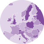
When you map variables that are independent of physical land mass, traditional choropleth maps can heavily distort reality . Huge regions dominate the visualization, even if they have low data values, while tiny areas nearly or entirely disappear.
This visual distortion becomes especially problematic when mapping normalized metrics like shares, ratios, or averages : think of average life expectancy, median income, or the share of urban population.
A famous example of this optical illusion is the viral animation "Land Doesn’t Vote. People Do." by Karim Douïeb, which illustrates how a geographic US election map gives a false impression of results by emphasizing acres over people:

🎭 Spatial Abstraction Levels
To represent regional units, cartographers can choose from a set of options in a progressive sequence of abstraction.
Click each map type to read more.
 1. Polygon FillingsThe Choropleth Map
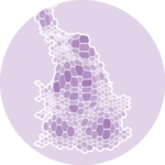 2. Proportional DistortionThe Cartogram
 3. Centroid PositioningKarim's Approach
 4. Equally-Sized BlocksThe Grid Map
🚏 The Distortion Detour
As cartograms are a really neat but rarely seen approach, let’s show you how to create those fancy distorted views!
The cartogram package provides functionality to resize regions based on a data column. Its cartogram_cont() function takes a spatial dataset and a numeric weight variable, and returns an sf object containing the polygons with distorted shapes.
Let’s quickly compare the two maps of the populations in countries of the African continent. Using the HYDE dataset, we first subset it to our region of interest and project our data with a suitable CRS. We then create the cartogram data based on the estimated populations and plot both datasets for comparison.
🏎️ The Centroid Crash-Course
Before we finally focus on grid maps, we briefly dive into the centroid positioning approach. We'll create a simple dot map of South America, and a variant with population-scaled bubbles.
Doors are closed 🚪
Enrollment for the current cohort is closed. Join the waitlist to be notified as soon as the next cohort opens, and become the ggplot2 expert your company needs!
Already enrolled? Login