Multi-Plot Layouts: The Composition of Charts
Small multiples and facets work wonders when repeating the same chart structure, but sometimes you need different views working together: an overview alongside focused detail, or complementary charts revealing distinct angles of the same data.
In this lesson, you'll learn how to combine plots from basic side-by-side arrangements to complex layouts. You'll practice controlling spacing and whitespace, adding overarching titles and clever tags, and placing inset charts with precise alignment to build visual hierarchy and intuitive flow.
🧱 From Grid-Lock to Creative Freedom
In our previous lessons on small multiples, we explored how facets automate the process of splitting a single plot into multiple panels. It’s a powerful way to handle homogeneous comparisons as every panel shares the same axes, geometries, and logic.
But to paint the full picture or tell a story, you often want to show different chart types and aspects of your data.
Multi-plot composition is about assembling distinct, independent charts into a unified visualization. While faceting is about subdividing a dataset, multi-plot compositions allow you to combine different datasets, aesthetics, and coordinate systems on a single canvas to reveal insights and to create a narrative logic or a hierarchy of importance.
🎯 The Logic of Insights
By combining multiple views, you can establish a visual hierarchy that guides the reader from high-level context to granular detail. And a visual narrative by ordering your charts in a logical flow that builds evidence piece by piece.
It is still incredibly common to see people export individual charts and manually stitch them together manually in PowerPoint, Illustrator — or Paint. This is not only a massive time-sink, but it’s a guarantee for inconsistent font sizes and jagged axis alignments.
More importantly: Manual "stitching" is a one-way street — every data update or chart change means you have to manually update and re-align everything again... 😰
Learning how to do this directly in your code is your secret weapon for creating multi-plot visualizations in an efficient, reproducible, and consistent way.
Here are 4 real-world cases where this becomes a game-changer:
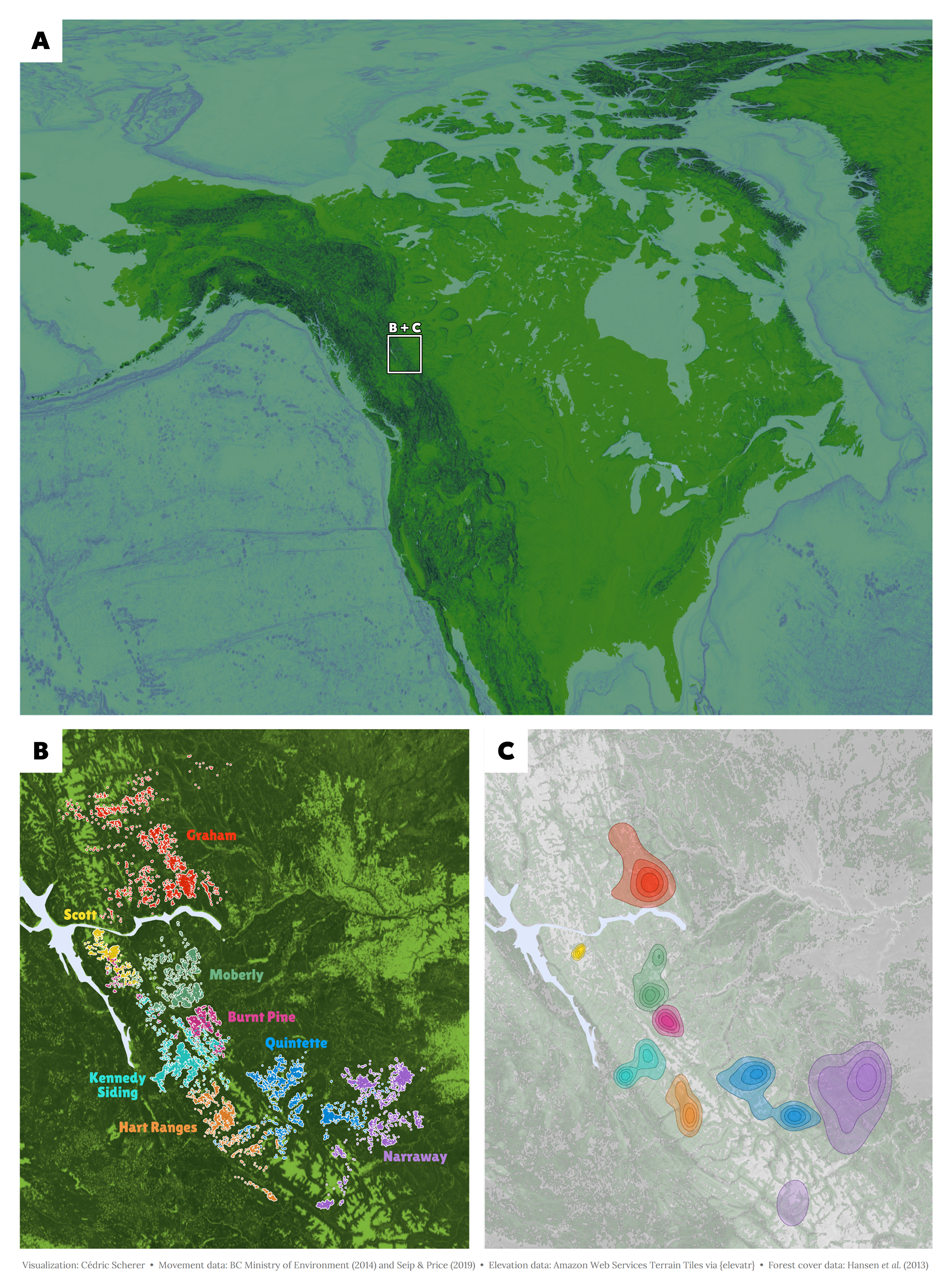
Journals often feature multi-panel figures that present results in a single graphic following a specific manuscript logic (e.g., Figure 1a, 1b, 1c). Using code ensures that spacing and alignment remain uniform and allows us to automate the numbering, ensuring labels stay in sync even after last-minute changes.
🏗️ The Tooling Landscape
The R ecosystem offers several ways to assemble multi-plot layouts. While they all aim to "stitch" plots together, their mental models and ease of use vary significantly.
Doors are closed 🚪
Enrollment for the current cohort is closed. Join the waitlist to be notified as soon as the next cohort opens, and become the ggplot2 expert your company needs!
Already enrolled? Login