Titles & Captions: Adding Context to Your Plots
A strong title can turn a good chart into a clear message. Subtitles, captions, and tags provide context, guide interpretation, and make your visual narrative easier to follow.
In this lesson, you’ll learn how to craft effective titles and apply best-practice principles for hierarchy and clarity. We’ll cover all label options that are available and demonstrate practical styling techniques to make titles, subtitles, and captions feel intentional and well-balanced.
📰 Why Titles Matter
Before you even look at the data points, your audience reads the title . It’s your first — and often strongest — chance to spark their interest, convey the key insight, and shape how they’ll interpret the chart. A good title doesn’t just label a plot; it guides attention, sets expectations, and frames the story.
Every day, people see graphics — whether it’s a slide in a presentation, a chart in a report, a dashboard widget, a news graphic, or something that shows up on social media. A thoughtful title helps the viewers instantly grasp the main idea, even if they’re skimming, scrolling, or only half paying attention.
And here’s the secret: a strong title also helps you clarify the message. If you can’t summarize the insight in one sentence, the plot may be unfocused — or the narrative still hidden inside the data.
Next, we’ll explore how to craft titles that are intentional, balanced, and genuinely helpful.
Throughout this lesson, we’ll illustrate good (and not-so-good) choices using our dataset — a fun playground for crafting titles that highlight trends, contrasts, or surprises.
🙇♂️ Crafting Intentional Titles
Now that we understand why titles matter, let’s talk about how to make them intentional, clear, and story-focused. A strong title doesn’t just describe the chart; it highlights the insight you want the viewer to remember.
Think of your title as the headline of a news article: concise, meaningful, and hinting at the story inside. Avoid vague phrases like “Data Overview” or “Chart of Episode Ratings” — they don’t tell the viewer what to take away.
There are a few key considerations when crafting a good title:
- Clarity — Make it obvious what the data shows — the main insight or trend — rather than just describing axes or variables.
- Brevity (with punch) — Keep it concise so the message is clear, but a few well-chosen, memorable words can make the title more engaging.
- Tone — Match your audience and context. A playful chart can have a witty title, while a formal report may need a neutral, descriptive heading.
- Focus — Highlight the key insight or trend you want the audience to notice. Avoid generic phrases like “Overview” or “Data Summary.”
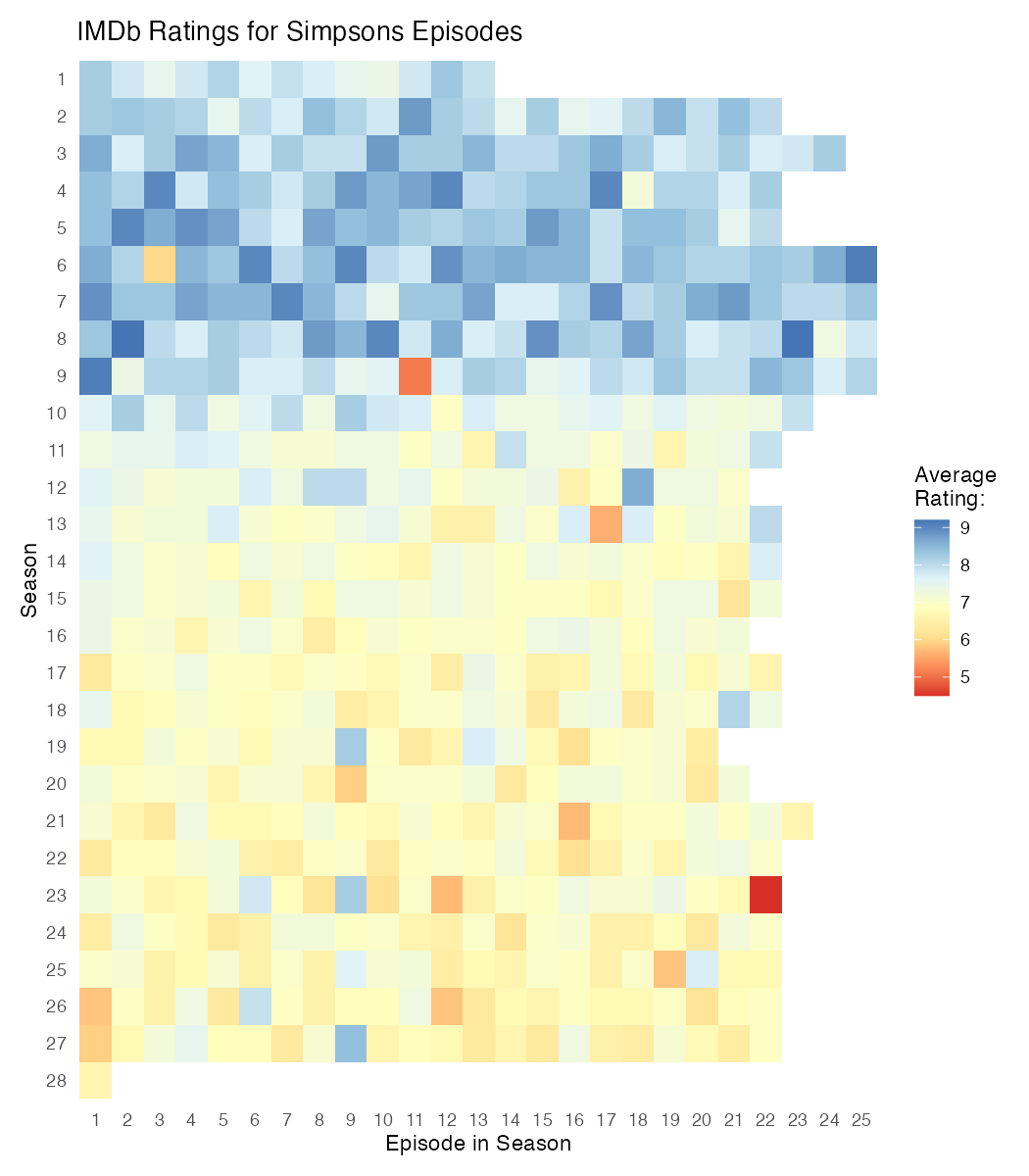
We’ll use a heatmap of average IMDb ratings for each episode, arranged by season, to explore how a title can shift from a neutral label to a meaningful message. The current title is intentionally plain — it only tells you what is plotted.
This title isn’t wrong — but it isn’t helpful. It simply restates what the chart contains without guiding the viewer toward the interesting part: the considerable decline in ratings after the early seasons. A title that highlights this pattern gives the viewer a head start by pointing them to the story hidden in the heatmap.
Let’s walk through a few potential options to see how small wording choices can make a difference.
- Descriptive Titles — simply state what is plotted. They’re technically correct, but don’t guide the viewer or highlight any insight. Also not the most exciting to read.
- “IMDb Ratings for Simpsons Episodes”
- “Heatmap of Season versus Episode Number”
- “Average IMDb Ratings for 597 Simpsons Episodes”
- “Simpsons Episodes: Overview of IMDb Ratings”
- Explanatory Titles — point out the key pattern or trend in the data. They communicate a clear message and are easy to read, but they tend to be a bit long and factual.
- “From Season 10 onwards, IMDb ratings for “The Simpsons” dropped considerably”
- “Ratings Decline Notable in Later Simpsons Seasons”
- “Average Episode Ratings Fall After Season 9”
- "IMDb Ratings Drop From an Average of 8.2 in Seasons 1–9 to 7.0 From Season 10 Onwards"
- Narrative Titles — tell a story or add a bit of flair. They help the chart stick in the viewer’s memory. But be careful and avoid exaggerating the findings or being misleading.
- “The Simpsons’ Golden Years Fade After Season 9”
- “From Peak to Decline: How Simpsons Ratings Dropped After Season 9”
- “The Fall of Springfield: Ratings Slide After Season 9”
- “IDMb Ratings Reveal a Dip in Quality Post-Season 9”
In practice, your choice depends on the context and audience. Usually, descriptive titles work for dashboards, explanatory for reports and slides, and narrative for web content and social media.
Now it’s your turn! If you like, update the heatmap to use your favorite title variant by changing the labs(title = ...) argument. Think about what works best for your audience and the story you want to highlight.
🪄 The Essentials Labs
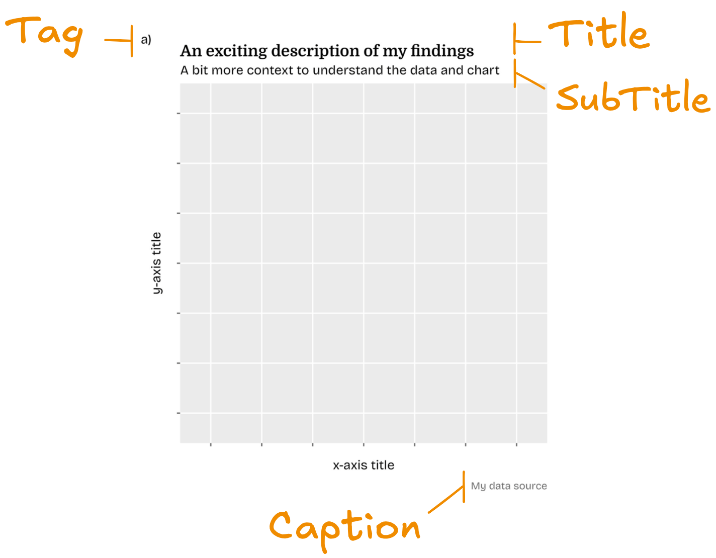
By now you’ve already met most text elements of a plot — titles, subtitles, captions, and also axis legend titles. They’ve shown up all over the course, and you may have played with their appearance in the Theme Attribute Explorer.
name argument in the relevant scale_* function to change axis and legend titles.Let’s quickly recap the basic labeling: The labs() function is your main toolbox for setting the title, subtitle,caption, and tag. Here, you can also modfy titles of axes via x and y and legend titles by addressing the respective aesthetic (like color or shape).
Subtitles are your secret weapon when a title alone isn’t quite enough. They’re perfect for a more nuanced depiction of the data shown, more context, or further clarification.
Captions hold your data source, small notes, disclaimers, or anything that shouldn’t compete with the visual itself.
🤝 Every chart using external data needs a reference. And if your work relies on inspirations or tools by others, it’s worth giving them credit in the caption, too!
And then there are tags: labels like “A” or “Fig. 1”, usually placed in the left-upper plot corner. They’re especially handy when including multiple charts in a report or when showing several plots side by side.
🏗️ Building Hierarchy
Once you have all your text elements in place, it’s time to make them visually clear and structured. A well-designed hierarchy ensures the title grabs attention first, subtitles guide the eye next, and captions or tags add supporting context without competing.
Conceptually, think of it like reading a page: the title should shout "look here first!", the subtitle whispers "here’s more detail" — and captions or tags quietly provide context or sources.
To create a clear visual hierarchy in a ggplot, you need to address plot.title, plot.subtitle, plot.caption, plot.tag, legend.title, and axis.title. As they’re all of the same type of element — text_element — all can be modified the same way.
You can adjust the size, color, and weight for emphasis and clarity, the family to match the topic, hjust and vjust for alignment, and the margin for spacing between elements.
Later when talking about text rendering, we’ll also see how colored words and bold highlights can subtly reinforce hierarchy and guide the reader’s eye.
Let's build a clear hierarchy by making the title both bold and set in a distinct typeface. For overall readability, we use Rethink Sans as the main typeface (via base_family) and give the subtitle a more comfortable line height.
We also place the axis titles at the beginning of each axis to support the natural reading flow and make a few additional margin and size adjustments here and there.
Before You Run the Next Codes 🧰
We’re using custom fonts in this lesson to make these plots look their best. To see everything correctly in the sandbox, please install Rethink Sans and Domine on your system! Then install the font files like any other system font.
In ggplot2, font sizes are interpreted as points (pt) — standard typographic units. But you’re not limited to fixed numbers. If you want a text hierarchy that scales cleanly, use rel()!
Its values are interpreted relative to the base font size of your theme. This is super helpful: if you later change the overall font size via base_size or theme = element_text(), all text elements using rel() adjust automatically — no manual recalculation and adjustment needed!
One more thing: the apparent text size also depends on your final figure dimensions. Pick your width and height early on so you don’t have to chase the perfect size again later.
↔️ The Perfect Alignment
Inside theme(), you can also control how titles and captions align: plot.title.position and plot.caption.position. Each can be set to "panel" (the default) or "plot".
Using "plot" aligns the text to the full plot border instead of just the panel area. This opens up cleaner layouts — for example when your y-axis labels are long and thus the title starts far from the plot or when you place a legend on the right and thus the right-aligned text is misplaced.
When adding a tag, keeping the default "panel" position can often make sense though:
- It helps avoid overlapping the tag with the title or subtitle and often gives a clearer visual hierarchy.
- The title won’t be fully aligned with the plot border anyways, as some space is reserved for the tag.
Tip: Aligning titles and captions with the plot border often makes visualizations look cleaner and makes them easier to read 💪
It’s a small adjustment that often improves overall balance. Before these options existed, getting this right often required a mix of margin hacks and manual nudging.
🎯 The Central Question
Crafting titles, subtitles, captions, and hierarchy isn’t decoration — it’s one of the most important steps in making a plot truly communicative.
A good title clarifies intent, sets expectations, and shapes how viewers read everything that follows. The title is so central that we often recommend drafting the title before drawing the chart.
Doing so forces you to think through your message early, guides each design decision that comes after, and helps you build toward a meaningful, explanatory visualization. A win for you and your audience!
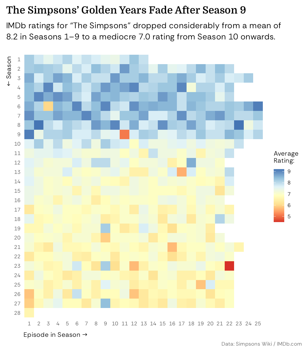
Earlier, our plot had only a plain descriptive title and almost no hierarchy. Now it carries a narrative title with a supporting subtitle, clear visual structure, and thoughtful spacing and styling. The result? A chart that reads confidently, guides the eye, and feels intentional.
🏆 Quiz
Let’s go through a few questions to check what you learned in this lesson.
What is the main purpose of a chart title?
Which text element is best used for data sources and disclaimers?
What is one advantage of using subtitles?
Which function controls titles, subtitles, captions, and tags in ggplot2?
Which argument aligns titles and subtitles with the full plot area?
What’s wrong with the title and subtitle on ?
What’s wrong with the title and subtitle on ?
What’s wrong with the title and subtitle on ?