Custom Themes: Fine-Tune Your Plot's Appearance
In the previous lesson, we explored how to use complete themes. But to create a true visual identity, you need to know how to customize themes.
It's time to dive deep into the theme() function and learn how to modify every aspect of your charts. Let's forget the defaults and make your visuals match your brand and publication style!
👋 Welcome to theme()
The theme() function lets you control the non–data parts of a ggplot — things like titles, axis labels, legend placements, grid lines, and backgrounds.
While built-in themes give you quick presets,theme() provides full flexibility. Think of it as the fine-tuning tool for your plot’s appearance. You can adjust individual elements, like an axis label or the background of the panel, to make your chart match your style or branding.
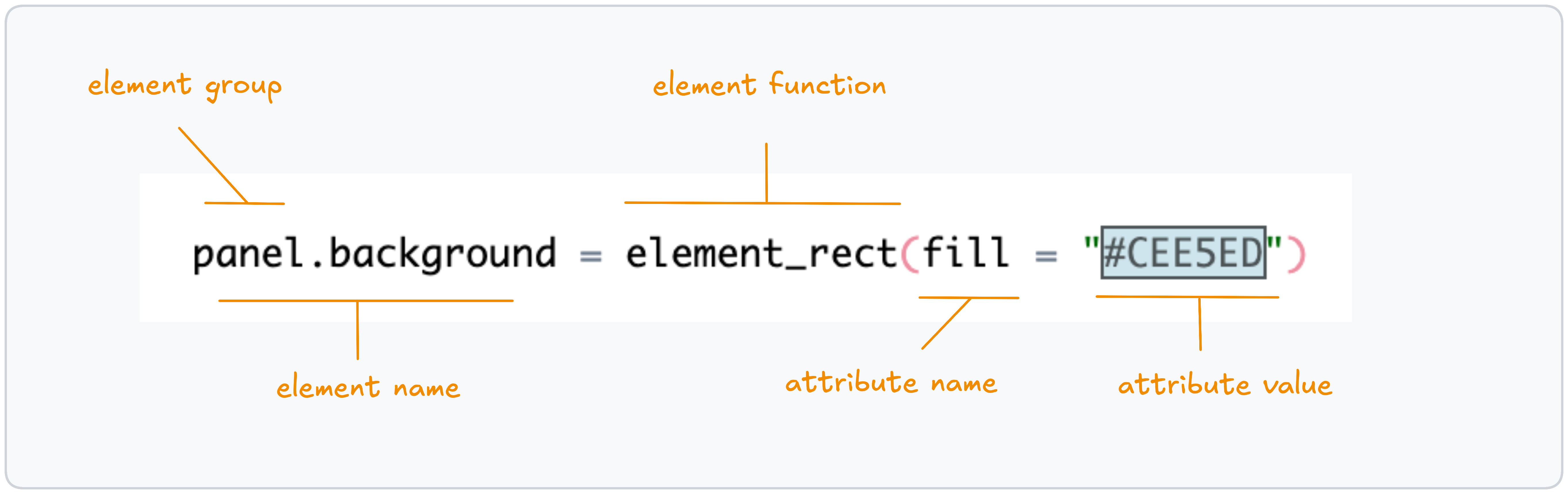
Let's start with a simple example. What if we want to change the panel background color? To do that, we address the corresponding element inside a theme() call:
Tip: You can also start from a non-default complete theme, e.g., theme_minimal(), and then tweak individual elements with theme(). That way you don’t have to define everything from scratch 💡
🦴 Anatomy of a Theme
The main building blocks of themes in ggplot2 are theme elements .
Consider the example above: to modify the background of the panel, you reference it using a hierarchy connected by . between levels. In this case, the element name is panel.background.
The value you assign to a theme element must be an element function . For the panel background, we use element_rect() , which is designed for elements drawn as rectangles.
element_rect() accepts several attributes , such as fill, color, and linewidth. To customize an attribute, simply provide a value for it.
🐇 Going Down the Rabbit Hole
The ggplot2 theme system is hierarchical and cascading: broader defaults flow “top-down,” and targeted tweaks override them where you set them. This lets you fine-tune specific parts of a plot without rewriting the whole theme.
The hierarchy is straightforward: start at a broad component and navigate down to the subcomponent you want to change. For example, use panel.grid to adjust all grid lines at once, or go deeper to panel.grid.minor.y to modify only minor horizontal grid lines.
This way, you can define the right level of change — coarse changes where you want consistency, granular tweaks where you need precision.
Don’t worry if it doesn’t fully click yet — explore the Theme Attributes Explorer below to provide an overview of the hierarchy and see common element names in context.
Ready to enroll? 🚀
Enroll now to unlock instant, lifetime access to every lesson, and become the ggplot2 expert your company needs!
Already enrolled? Login