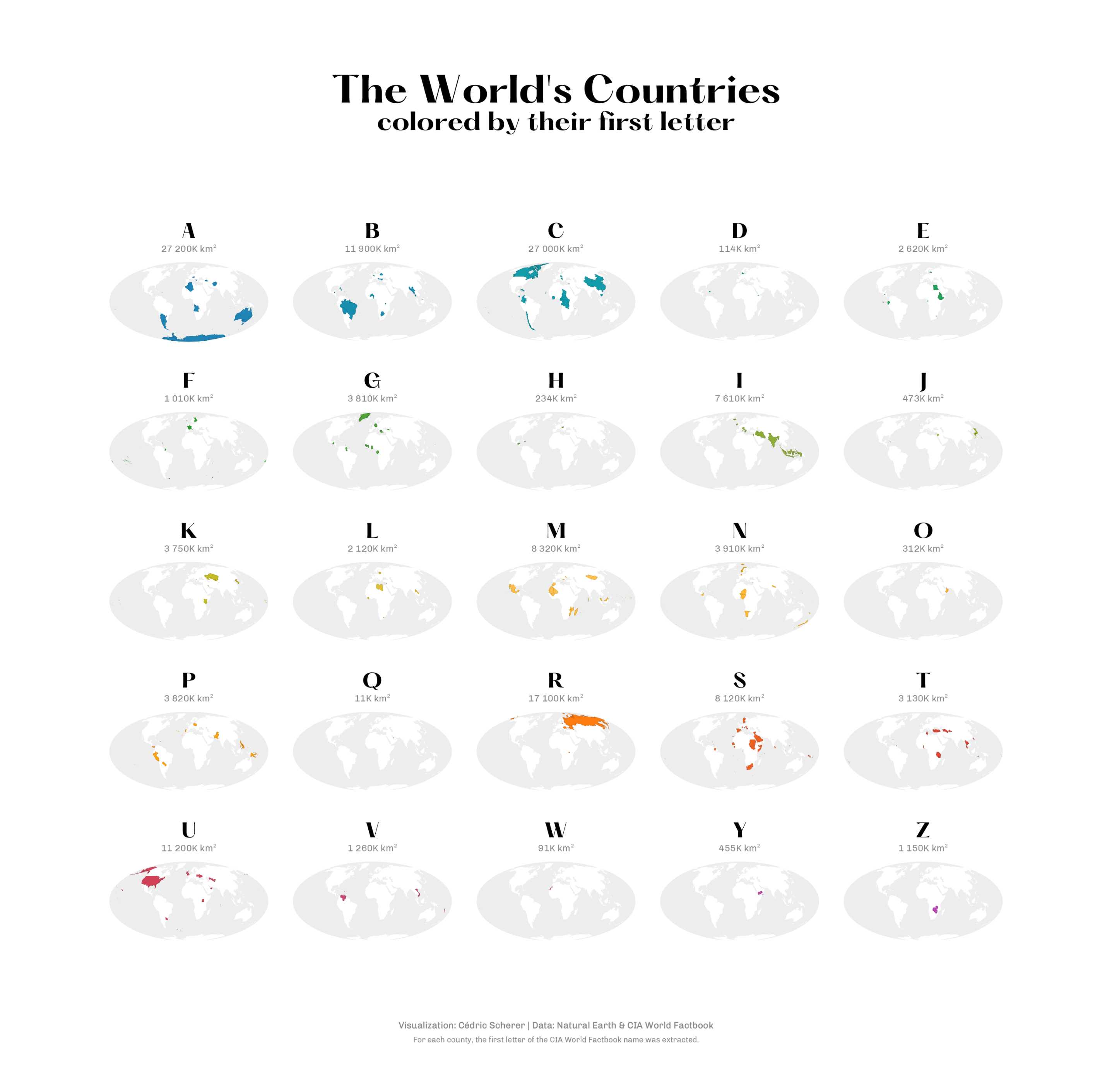
Small Multiples: Comparing Subsets with Facets
Small multiples, also known as facets, are a powerful way to compare patterns across groups by repeating the same chart for different subsets of your data. Instead of squeezing everything into a single crowded panel, you can lay out a grid of consistent plots that make similarities and differences easier to spot at a glance.
In this lesson, you’ll learn how to use faceting to break data into meaningful subsets, control the layout and scales of your panels, and decide when small multiples are the right tool for your story.
🧩 Many Charts for One Question
You've probably seen charts where the same chart type repeats in a tidy grid, each panel showing data for a different group or time period.
This approach — splitting one crowded plot into many consistent panels so you can compare patterns side-by-side — is called small multiples . Data viz practitioners, from analytic labs to newsrooms, love them for comparing economic trends, election results, or sports stats as readers instantly grasp variation without hunting through legends or toggling filters.
Their magic lies in repetition: by keeping axes, colors, and scales identical across panels, differences between groups pop out immediately. Instead of squeezing everything into one noisy panel, small multiples give each group breathing room while letting your audience scan the full picture at once.
Edward Tufte popularized the term small multiples in his 1990 book “Envisioning Information.” However, the concept of using multiple similar charts to compare data across categories has been around for much longer.
Tufte stated that the most important question for quantitative reasoning is “Compared to what?”, concluding that:
“For a wide range of problems in data presentation, small multiples are the best design solution.”
He argued that showing many small, consistent charts enforces comparisons and allows viewers to see patterns and trends across categories without the clutter of a single, complex graph.
Small multiples also solve the qualitative color conundrum from our “Color Choice” lesson when dealing with many categories: Instead of straining to match dots to an 8+ color legend, each category gets its own panel, making it easy to spot differences without needing color at all.
ggplot2 for the first time — the start of a 💙 story.And here's the best part: ggplot2 makes small multiples incredibly easy. Just one function call transforms your single crowded plot into a clean grid of comparable panels, one for each group or combination.
🧱 Pick Your Favorite Facet
In ggplot2, there are two ways to create small multiples: facet_wrap() and facet_grid(). Both split data by categorical variables into separate panels, but they arrange and handle your splits differently.
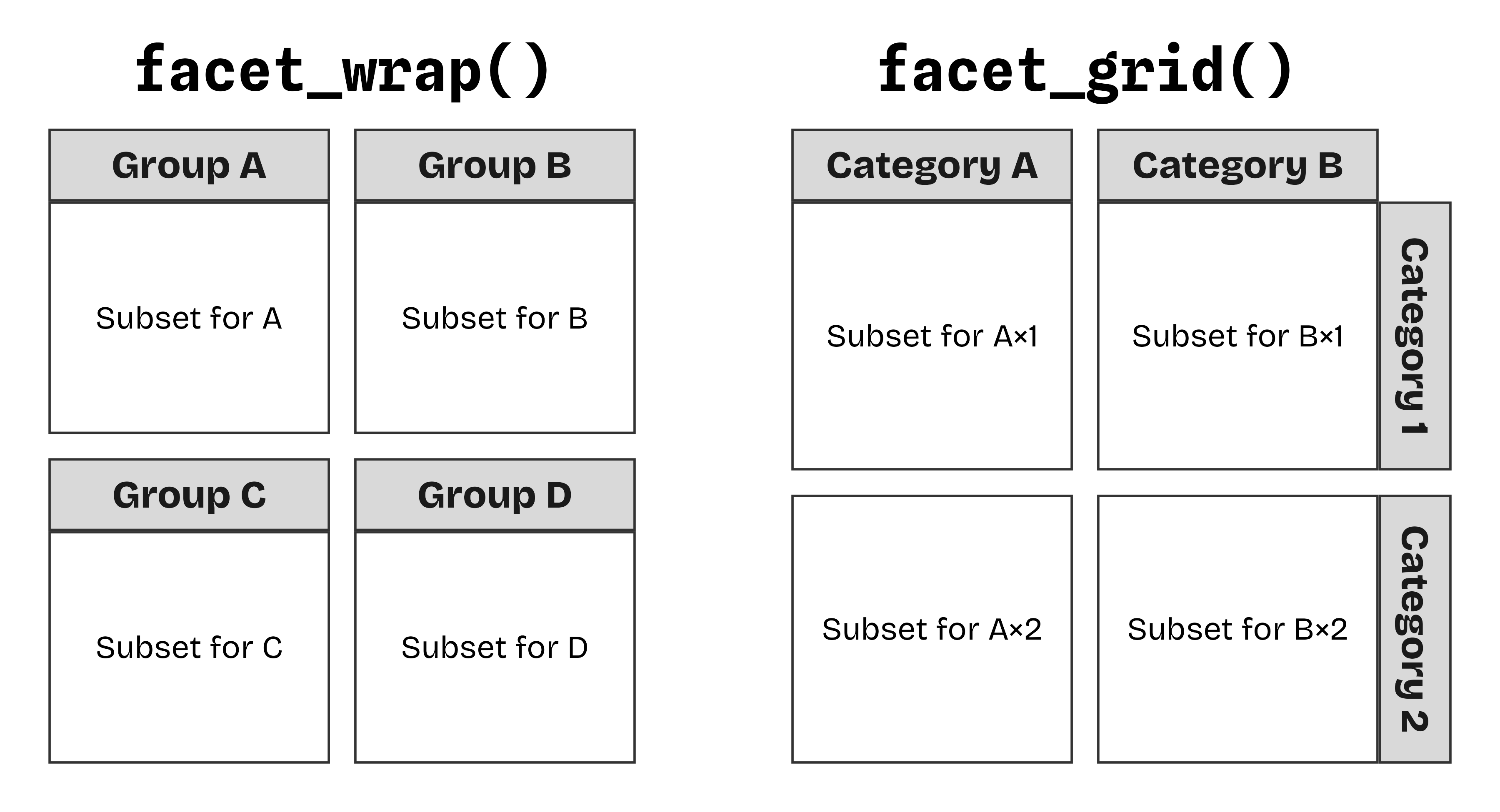
facet_wrap() flexibly rearranges panels to fill space automatically, while facet_grid() creates a true grid defined by its row × column variables.facet_wrap()
facet_grid() comes into play.The function facet_wrap() takes one categorical variable using either vars(category) or ~category syntax, intelligently wrapping panels into a compact grid that fills available space.
It's perfect for subsetting multiple categories of the same importance (or a few that fit together) when you want to fill the space efficiently or use a specific layout.
facet_wrap() splits your data by the facets variable
→ thus, the layout is flexible and adjustable
facet_grid()
The function facet_grid() creates a true matrix layout, laying out panels in a fixed grid of rows and columns. It guarantees every combination gets its own cell, even empty ones.
It's ideal for comparing a range of combinations and for designed cross-breakdowns like region × year — or species × sex:
facet_grid() splits your data into rows and cols
→ thus, the panels are arranged in a fixed matrix layout.
. as a placeholder that says "don't split anything on this dimension."You can use facet_grid() even for a single variable if you want to force all panels into a single row or column. Using the formula . ~ variable will stack panels vertically (one column), while variable ~ . will align them horizontally (one row). This is often cleaner than facet_wrap() when you want your facet labels ("strips") to stay pinned to of the panel edges.
Every plot you create technically has a facet component. Just like scales, the coordinate system, and the theme, ggplot2 applies a default when not specified explicitly: facet_null() which create a single panel — nutil you explicitly overwrite it with a multi-panel facet_*() function.
🎛️ Fine-Tune Your Facet Layout
Both facet_wrap() and facet_grid() come with powerful arguments to control layout, scales, and spacing. The most useful ones are nrow and ncol for custom layouts, scales for axis sharing, and space for proportional spacing.
🔡 Control the Panel Layout
facet_wrap() automatically fills space, but you can override it with specific dimensions. facet_grid() respects your row × column formula but still lets you squeeze into custom shapes. To enforce a certain number of rows or columns, use either nrow or ncol:
By default, panels are filled left-to-right and top-to-bottom, following alphabetical order or factor levels. To reverse this and start filling the grid from the bottom-left (like a coordinate system), set as.table toFALSE.
📏 Shared, Free, and Proportional Scales
Usually, axis ranges should be the same for all panels. This is best practice as it ensures that comparisons between panels are direct and unbiased.
The default in ggplot's facet functions, scales = "fixed", follows this practice and prevents users from accidentally creating misleading facets.
You can switch to scales = "free" to allow each panel (for wrap) or row and column (for grid) to have its own axis range. To freely scale only one axis, use "free_x" or "free_y".
This is ideal when groups have vastly different ranges and the focus is on the individual pattern, not comparison across groups — like showing distributions of individuals in species of different body masses or population trends of countries.
ggplot2 v4, this option was only available for facet_grid().When categories have uneven group sizes and you are using freely ranging scales, you can prevent misleading comparisons by setting space = "free" (or "free_x"/"free_y"). This makes the physical dimensions of each panel proportional to the data range it contains. Sparse groups get smaller panels and dense groups get larger ones, ensuring visual distances remain consistent across the grid:
Note how the varying dimensions of the panels give away immediate data insights:
- The width of the columns reveals that Chinstrap and Gentoo penguins have a narrower range of bill depth measurements than Adelie penguins.
- The height of the rows shows that the ranges in bill length are very similar for female and male individuals across species (but much more narrow for individuals of unknown sex).
↔️ Comparison, Made Simple
Often, a critique when comparing multiple groups is that while it allows readers to see individual trends, it can be hard to compare specific values across those groups.
A simple solution is to add the complete dataset to each panel — but only as a shaded background layer to provide context for comparisons.
ggplot2 v4, layers have a new layout argument: when set to "fixed", it gets plotted across all panels.The trick here is to add another layer with a dataset that does not contain the faceting variable — this way, it gets plotted in all panels. You can achieve this by dropping the faceting column from the data used in that specific layer.
In base R, you can use subset(df, select = -c(facet_vars)); with the tidyverse, you can use dplyr::select(df, -facet_vars).
An even better approach is renaming the variable, for example via dplyr::rename(df, "new_name" = facet_var). This is beneficial as we can still use that variable (just with its new name) for mapping in the "background layer".
When working with grids, you can also use the margins argument to add extra panels to the right and bottom that provide a complete overview of all data:
💄 Styling Small Multiples
We covered theme options in our lesson on customizing themes, but here is a quick recap of the properties most useful for styling small multiples:
panel.spacing— Increase or decrease the distance between panels; usepanel.spacing.xorpanel.spacing.yfor targeted control.strip.text— Control the font style, color, and margins of the facet labels.strip.background— Change the background color and outline of the facet labels.strip.placement— Specify if labels should be "inside" or "outside" the axes → useful when combined withswitchinfacet_grid()orstrip.placement()infacet_wrap().
Let's illustrate these options with two examples:
Our population chart with themed strips and more space between pabels. Use the axes argument to repeat the x axis for each panel.
🎁 Wrapping It All Up
Faceting is more than just a layout trick. It is a fundamental tool for clear communication.
By breaking complex datasets into consistent, digestible chunks, you allow your audience to see patterns that would otherwise be lost in a "spaghetti" of overlapping points and lines.
facet_wrap()
Best for a single variable with many levels. It wraps panels into a "ribbon" that flows across the page, making it the most space-efficient way to show many groups.
- Flexible number of rows and columns.
- Ideal for simple comparisons.
- Uses
vars(x)or~x.
facet_grid()
Best for cross-tabulated variables (rows × columns). It creates a structured matrix where every cell represents a specific combination of factors.
- Fixed matrix structure.
- Ideal for seeing interactions between two variables.
- Uses
rows = vars(y), cols = vars(x)ory ~ x.
Remember the Golden Rule of Faceting: Consistency is key.
Whenever possible, keep your scales fixed. Only "free" your axes when the individual trends within panels are significantly more important than the comparison between them. And if you do so, give proportional scaling a try and see if it might be a good compromise!
🏆 Exercises
Now that you've seen how facet_wrap() and facet_grid() work, it's time to try them out yourself.
In the following exercises, you'll practice choosing between wrap and grid, troubleshooting scale issues, and applying background "shadow" layers to make your comparisons pop.