Geometric Layers: Choosing the Visual Representation
Bars, lines, points, and beyond — geometric layers define how your data appears on your panel. Think of them as the “verbs” in your visualization sentence.
This lesson explores how to pick the right geom for the job and how different layers can be combined to tell richer, more nuanced stories.
🧂 The Final Ingredient
In the previous lessons, we covered the plot’s backbone — your data, and the aesthetics that map it to visual properties. But if you tried running a plot with just those, you’ll have noticed: nothing shows up inside the panel (a.k.a. the gray area).
That’s because every ggplot needs at least one layer to actually display anything. And most often, that layer is a geom_*().
So far, you’ve already seen and used several of these layers:
geom_point()→ show individual observationsgeom_line()→ connect data pointsgeom_col()→ display values as barsgeom_smooth()→ add trend linesgeom_text()→ label points with text
🧩 Not All Geoms Want the Same Things
All of the geoms listed above will happily show up when added to our "empty panel" code with just x and y mapped — well, all but one.
Can you guess which one won’t play along?
Yes, this task should ring a bell if you explored the “Lost for Words” exercise in the Aesthetics: Caveats lesson.
It’s geom_text() that stays silent. Not because of a bug — but because it’s still waiting for one more piece: a label aesthetic. While we can draw a point or bar with two coordinates, geom_text() and geom_label() need to know what to write.
This isn’t unique to geom_text(). For example, geom_point() can’t draw a point without knowing where to place it, so it expects both x and y. Otherwise ggplot2 will throw an error and inform you about missing aesthetics:
Error in `geom_point()`: Problem while setting up geom. `geom_point()` requires the following missing aesthetics: y.
Every layer expects certain aesthetics to be present.
- Geometries that require two positions, usually
xandy, are the most common case. - Others need a third aesthetic such as
labelforgeom_text()orfillforgeom_tile(). - Some layers are minimalists: for example,
geom_bar()only required anxoryposition to place the bar — and calculates the height or width, respectively, itself. - And some demand many more, often specific aesthetics such as additional
xendandyendto draw a line withgeom_segment()to define start and end coordinates.
Now that you know some geoms need different numbers and types of aesthetics, let’s explore them in more detail.
📈 A World of Chart Types Geoms
The world of data visualization includes countless chart types. While the possibilities are virtually endless, mastering the fundamental ones is key to clear and effective communication.
This classification follows the structure proposed by the Data To Viz project.
Below is a quick overview of chart types, grouped by their main purpose. ggplot2 can create all of them → it's just a matter of choosing the right geometric layer.
Click any chart icon to see which geom it uses and what aesthetics are required — or explore the other way around!
 Violin
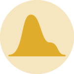 Density
 Histogram
 Boxplot
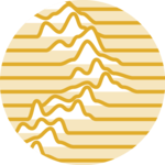 Ridgeline
🥞 Layer by Layer
One of the most powerful ideas in ggplot2 is that plots are built layer by layer. That means you’re not limited to a single geom — you can stack multiple geoms on top of the same data, or even different data.
For example, you might want to:
Ready to enroll? 🚀
Enroll now to unlock instant, lifetime access to every lesson, and become the ggplot2 expert your company needs!
Already enrolled? Login